MS Canada
MS Canada (formerly Multiple Sclerosis Society of Canada), is the leading organization in Canada dedicated to bringing positive change to those affected by multiple sclerosis. Canada has one of the highest rates of MS in the world and yet very few people know about it. Inspired by the vision of a world free of MS, MS Canada works with researchers, donors, partners, volunteers, and people living with MS to bring about positive change. Whether improving the lives of Canadians today or supporting high-quality research that aims to end MS tomorrow, they work together as a community. MS Canada connects the MS community to programs, information, research and to each other while they are on their MS journey.
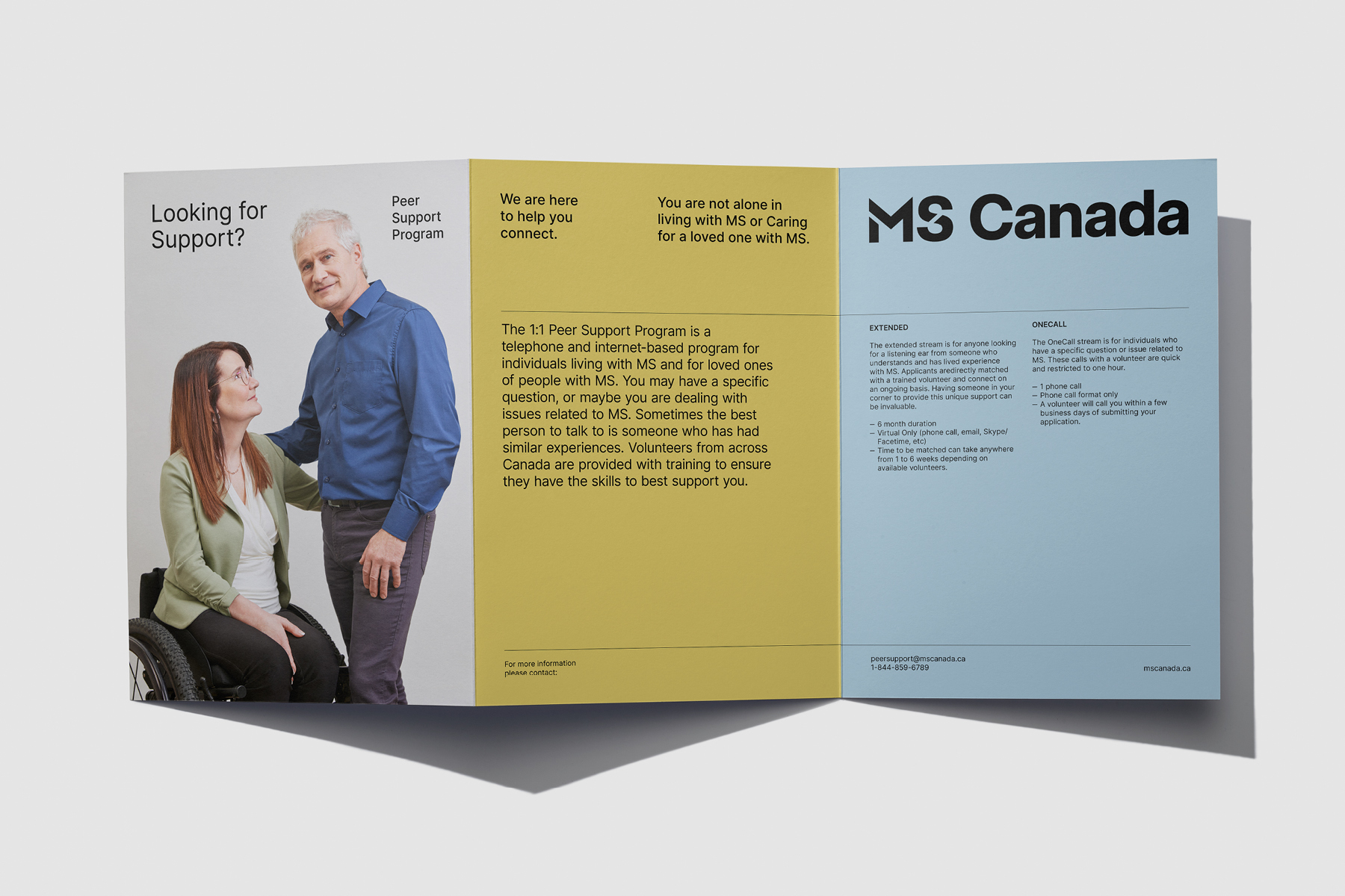
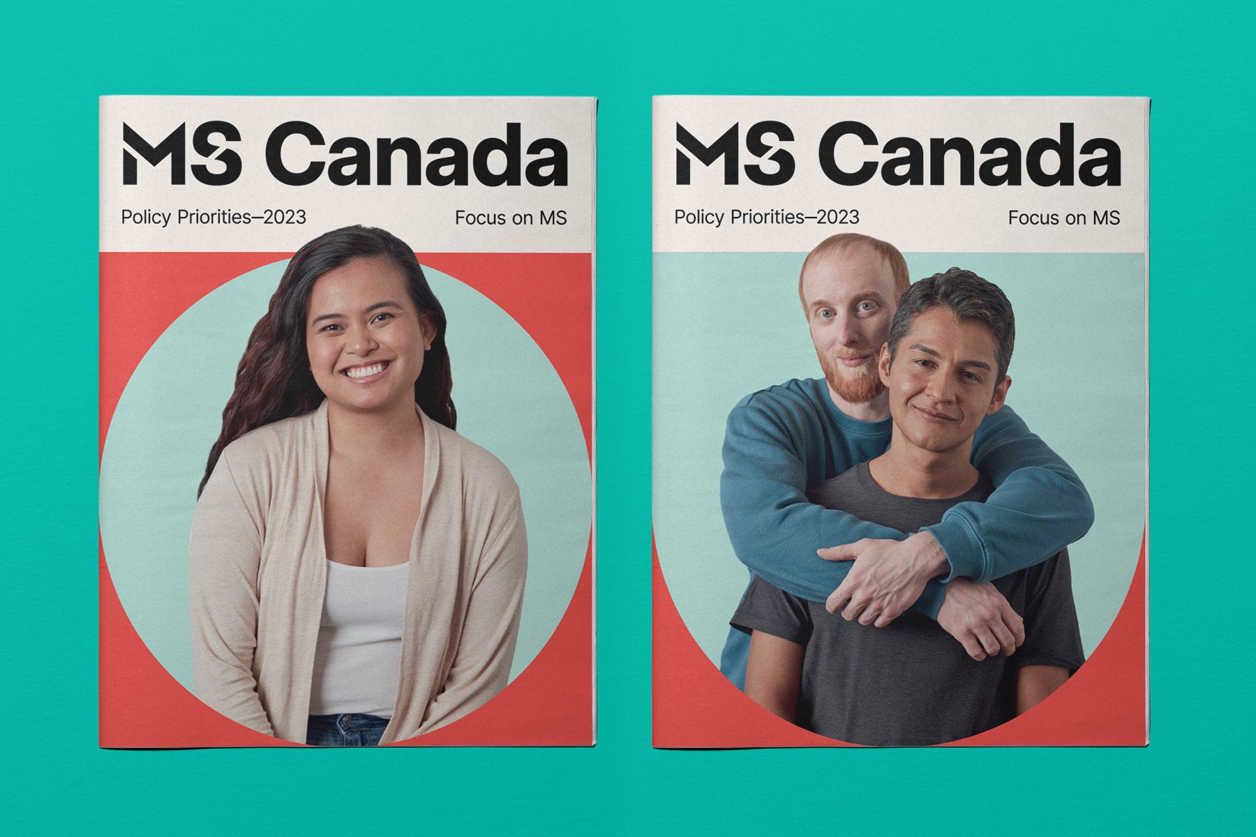
LG2 was approached by MS Canada to develop a new brand strategy and identity that highlights the organization's ability to connect with various groups of people and initiatives all while focusing on the people affected by MS. The mandate grew to include a launch strategy/platform and original photography.
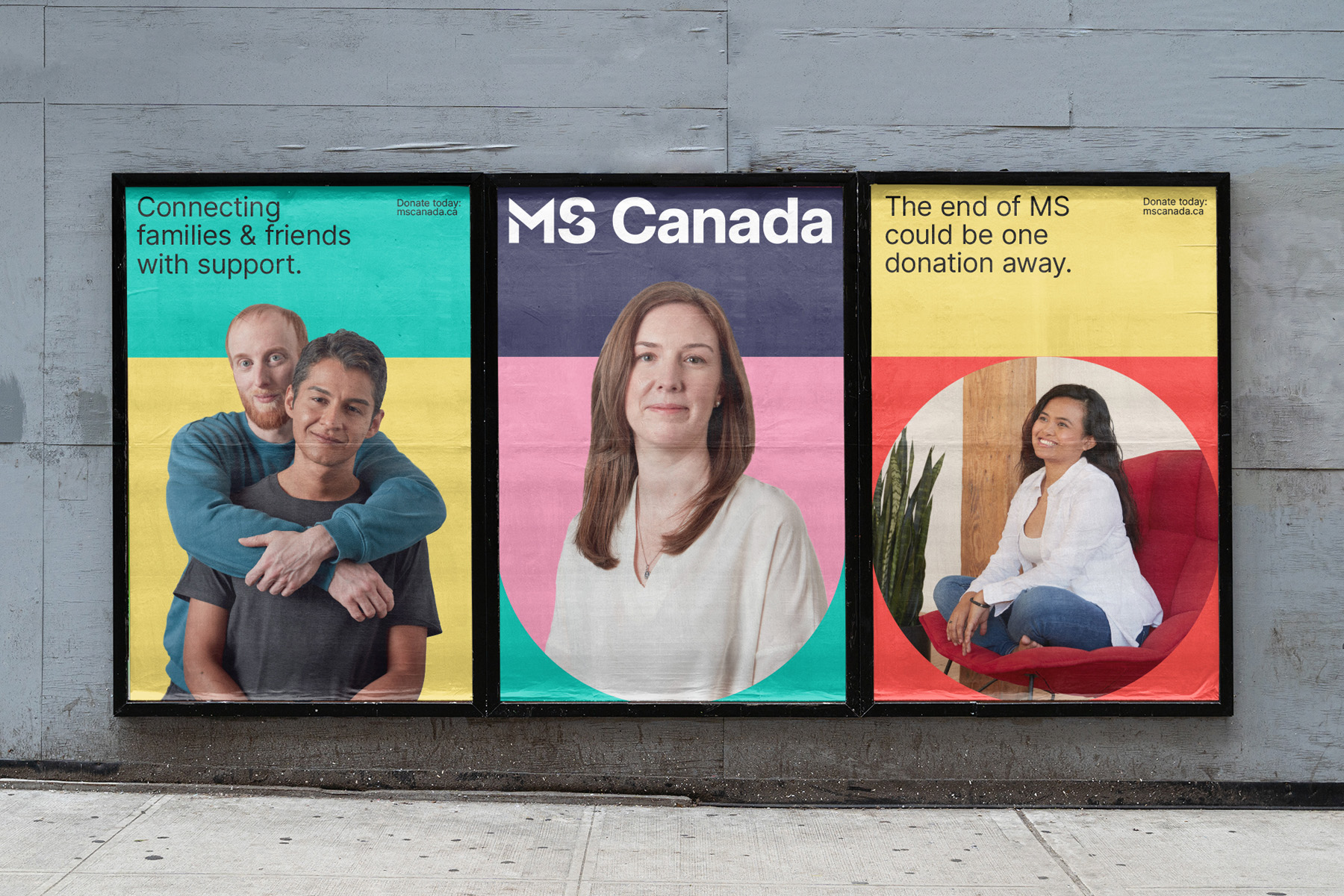
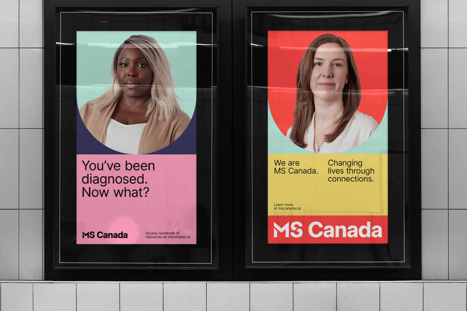
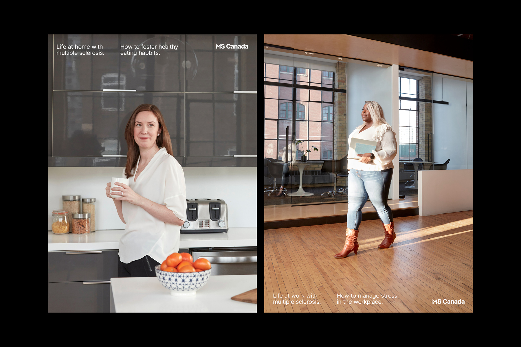
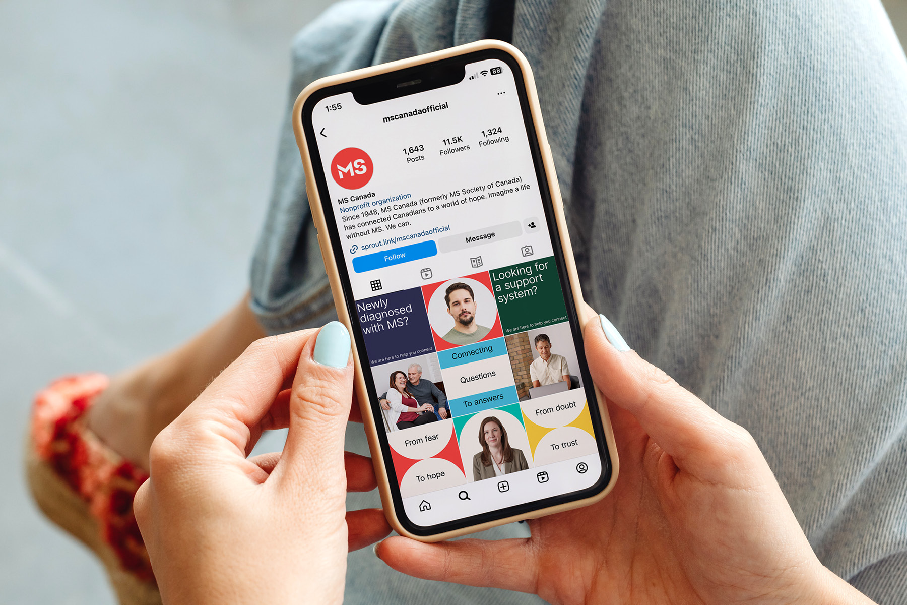
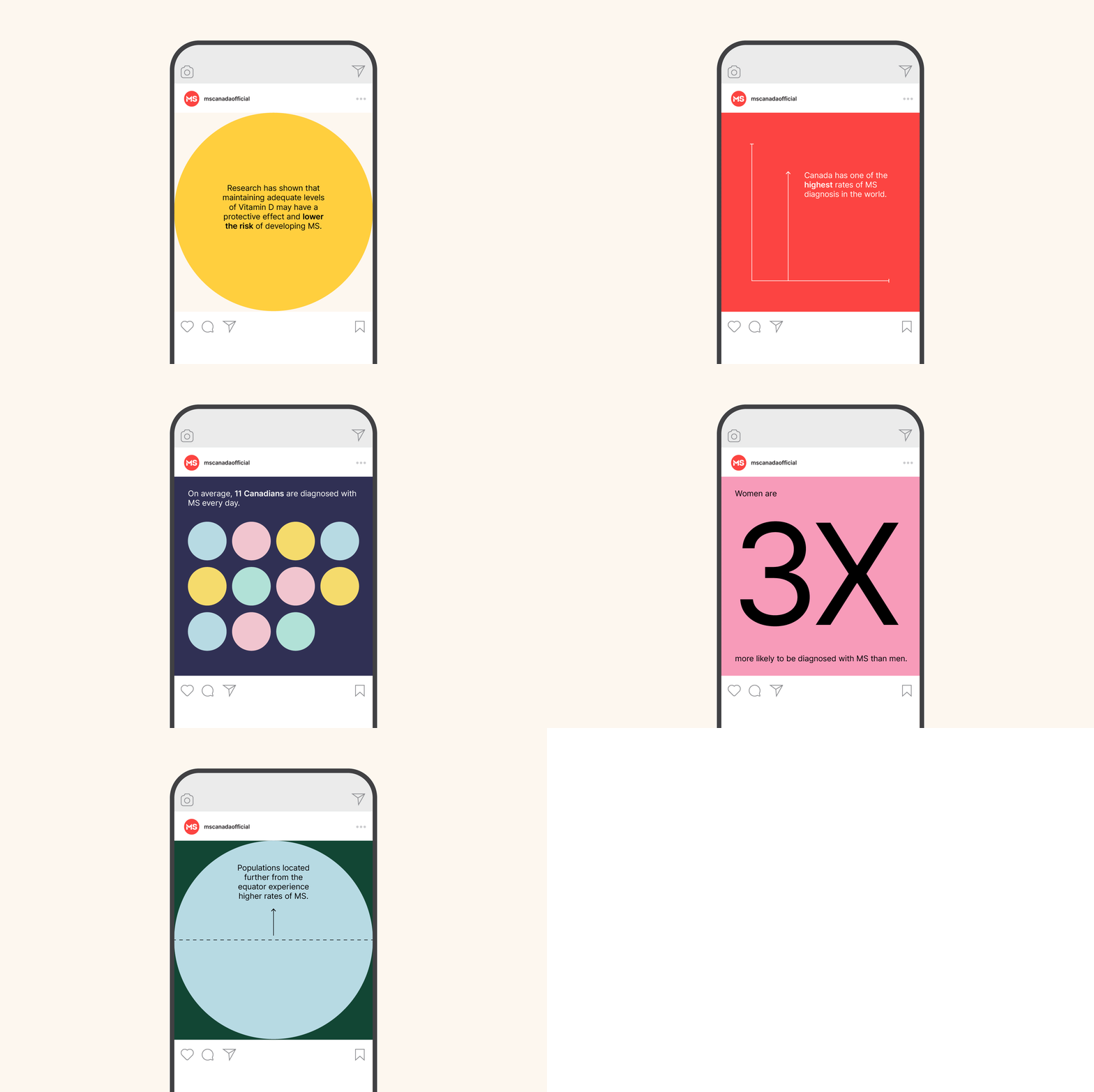
We created a vibrant and energetic brand identity that embodies the idea of connection and community, using focused portraits and a modular shape system as a device to reflect the many ways that MS Canada creates connection. People are the centre of the organization, and this is emphasized through the portraiture photographic style that highlights the emboldened, proud members of the community. The expansive colour palette is flexible and adaptable in order to speak to Its various audience groups while signalling the hope and optimism that MS Canada imbues. For the logo. we were mandated to retain the broken MS symbol, so we revitalized the wordmark with a modern and clean typeface to reflect this new era for the brand while nodding to the organization's rich history.
Client: MS Canada
Agency: LG2
Role: Lead Designer, Art Direction
Designers: Grant Irving, Murilo Maciel
Executive Creative Director: Ryan Crouchman
Group Account Director: Antoine Levasseur
Account Manager: Danielle Mastronardi
Copywriters: Suzanne Pope, Scott Hildebrant
Strategists: Nathalie Houde, Hervé Seck
Photographers (TO shoot): Saty + Pratha

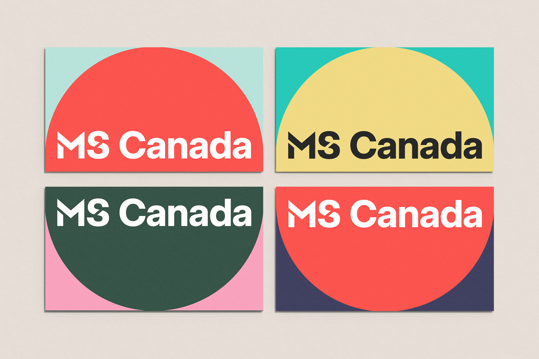
Above: The existing “MS” carried significant equity. We were asked to keep this component so it was refined to work within a custom typface created for the wordmark.
Above: We developed a shape toolkit to highlight MS Canada’s mission to both provide connection and focus on MS.
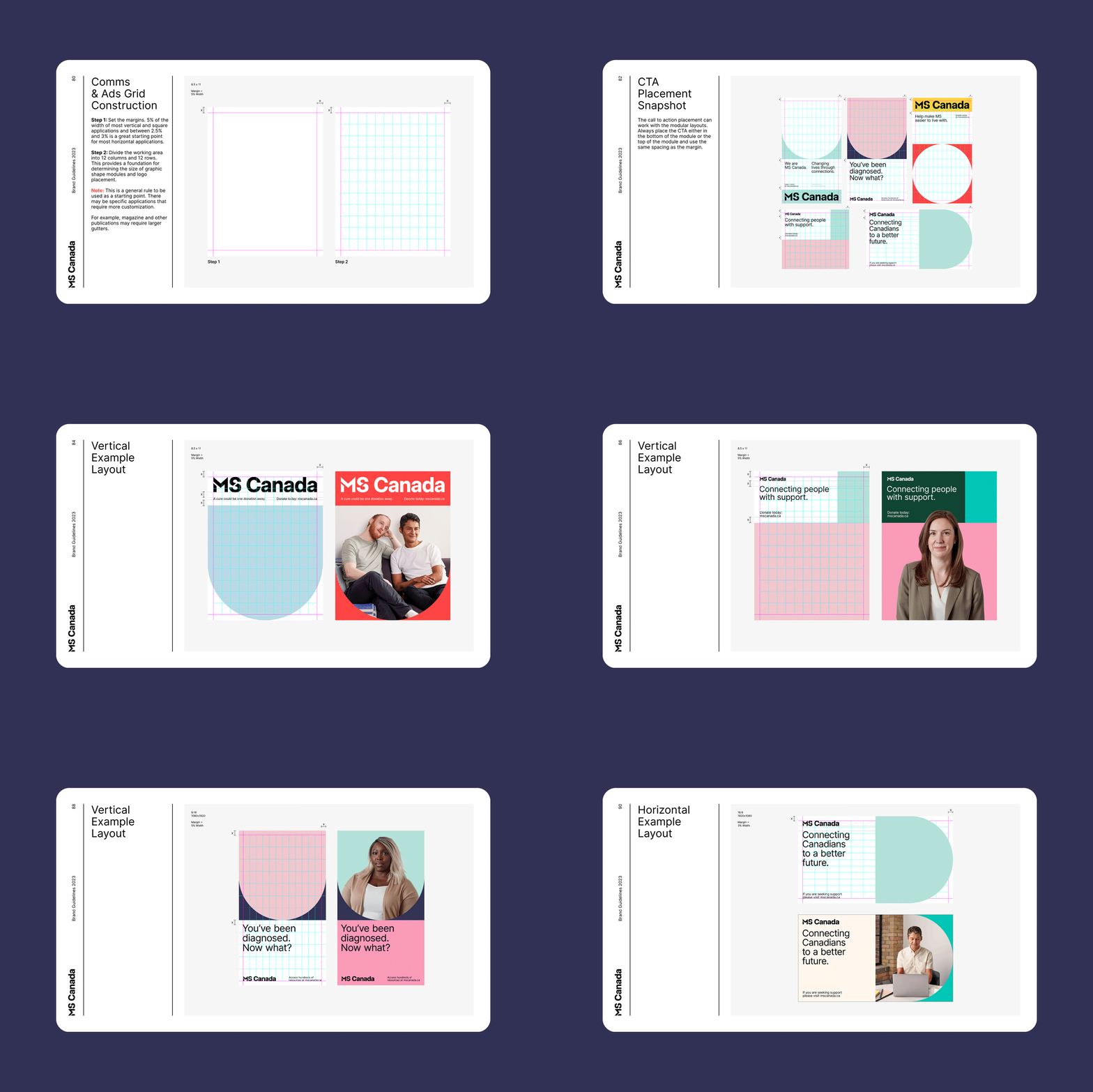
Above: A flexible grid system was created to act as a foundation for the shape toolkit.
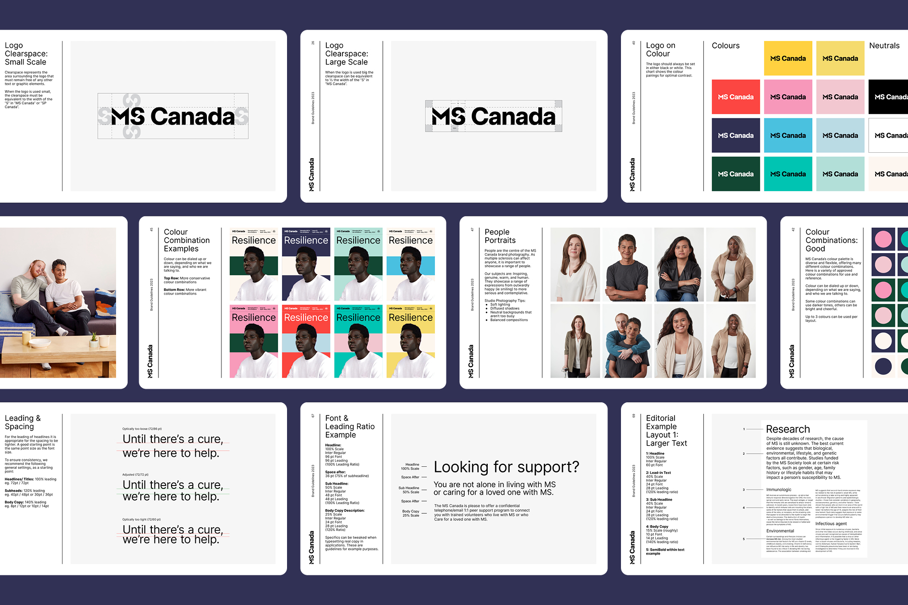
Above: All core elements of the design system were documented in a thorough brand guidelines.






Selected Works

WPI Re:ConnectEvent Branding
LatticeBranding

MS CanadaRebrand, Art Direction

LCBO Holiday 2023Packaging, Art Direction

LCBO Spring 2024Packaging, Illustration, Art Direction
American Apparel Printwear TourEvent Material

Future FuelBranding, Packaging, Web Design

Relics ZinePublication Design

Electric IslandBranding
